
What is visual identity?
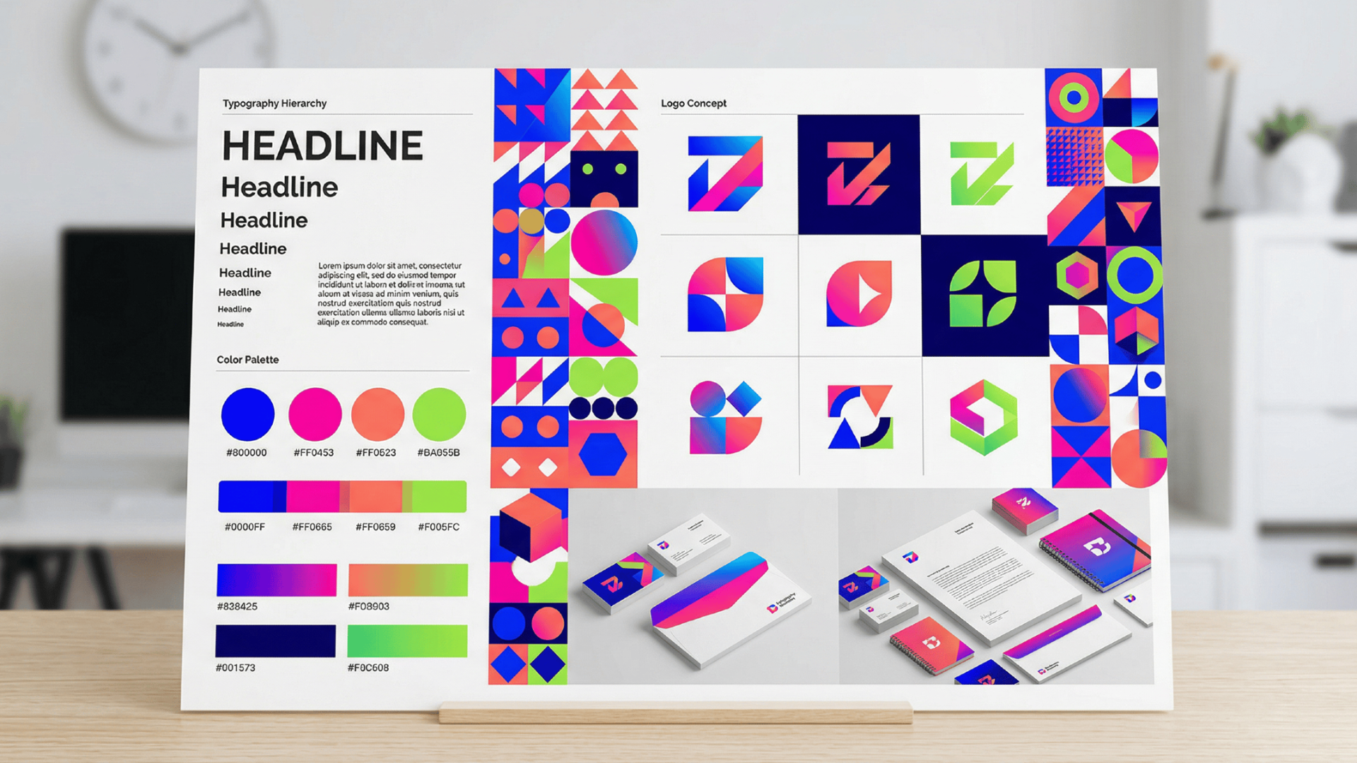
Visual identity encompasses all the visible elements that a brand uses to present itself to the world. It is the visual language that communicates a company's personality, values, and essence without saying a word. This identity acts as the aesthetic face of your business, turning abstract concepts into tangible designs that audiences can see, recognize, and remember.
From the logo on your website to the color palette of your marketing materials, every visual cue works together to create a cohesive image. Ultimately, it is the foundational visual framework that distinguishes your brand from competitors in a crowded marketplace.
Why is visual identity important?
In today’s hyper-competitive market, a compelling visual identity design is no longer just a nice-to-have aesthetic asset; it is a critical business tool that drives recognition, builds trust, and fosters connection.
- Creates strong first impressions: Consumers make split-second judgments about your brand based entirely on aesthetics. A professional, cohesive look instantly signals credibility, ensuring that potential customers perceive your business as reliable and high-quality before they even read a single word.
- Drives brand recognition: Consistency across visual elements trains your audience to instantly identify your business. When customers repeatedly see the same colors, fonts, and logos, it embeds your brand into their memory, making you their go-to choice when needs arise.
- Builds emotional connection: Colors and imagery evoke specific psychological responses. By strategically designing your visuals, you can make your audience feel excited, secure, or inspired, fostering a deeper, emotional bond that goes far beyond simple transactional relationships.
- Differentiates from competitors: In saturated markets where products are similar, visuals set you apart. A unique design language highlights your distinct personality, ensuring you don't blend into the background and giving consumers a clear visual reason to choose you.
- Establishes trust and consistency: A scattered visual presence looks amateurish and confusing. A unified visual system demonstrates attention to detail and stability. This consistency reassures customers, projecting an image of an established, trustworthy company that will deliver on its promises.
Visual identity vs brand identity: learning the differences
While often used interchangeably, visual identity and brand identity are distinct concepts.
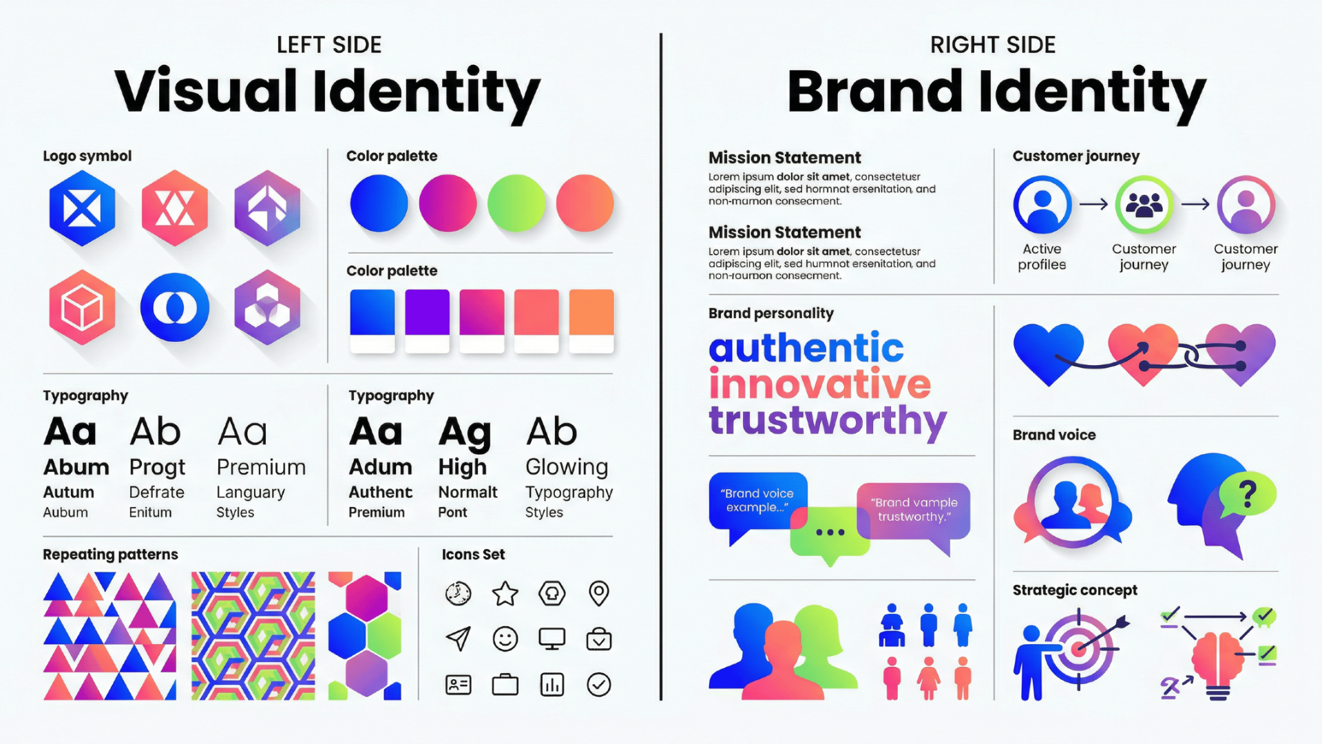
Brand identity is the overarching foundation of your business; it is the intangible personality, voice, mission, and core values that define who you are. Visual identity, on the other hand, is the tangible subset of that brand identity. It is what people actually see. If brand identity is your company’s soul, visual identity is its physical appearance.
Here are the four main differences:
- Scope: Brand identity covers everything (internal values, messaging, culture), whereas visual identity is strictly limited to aesthetic elements.
- Nature: Brand identity is largely strategic and conceptual, while visual identity is entirely tactical and sensory.
- Expression: Brand identity is expressed through tone of voice and actions; visual identity is expressed through design, colors, and imagery.
- Creation: Marketers and founders shape brand identity, but graphic designers and art directors craft the visual identity.
Six essential elements of a strong visual identity
A successful visual identity graphic design is not created by accident; it requires a strategic combination of specific design components. These core elements work in harmony to build a cohesive brand experience.
1. The logo
Your logo is the centerpiece of your visual identity. It acts as the primary visual identifier, essentially serving as the face of your company. A well-designed logo must be memorable, versatile, and deeply reflective of your brand's core values. However, a logo is rarely just one single image.
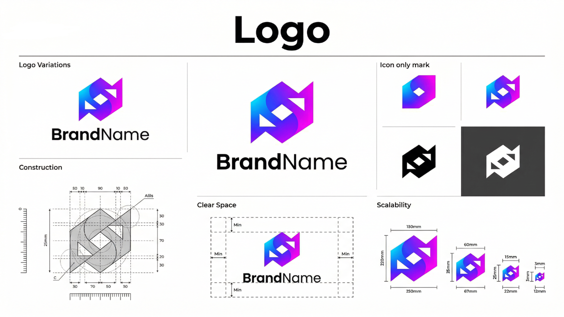
A robust visual identity system includes a versatile logo family to ensure it looks perfect across all mediums:
- Primary logo: The main, most complex version used in high-visibility areas.
- Secondary logo: An alternative layout (like a stacked version) for different spatial constraints.
- Brand mark (icon): A simplified symbol used for social media avatars or favicons.
2. Color palette
Color is a powerful psychological tool that instantly communicates mood and personality. Your brand's color palette shouldn't just be your favorite colors; it must be a carefully curated selection that resonates with your target audience. A strong identity avoids overwhelming the viewer by sticking to a well-structured hierarchy.
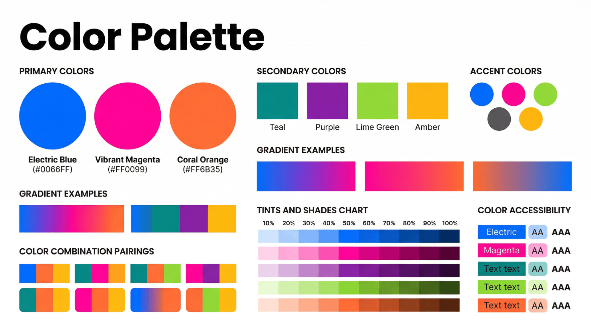
An effective palette typically features:
- Primary colors: The one or two dominant colors your brand is known for (e.g., Coca-Cola red).
- Secondary colors: Complementary shades that add depth and variety to your designs.
- Neutral/background colors: Whites, grays, or blacks that provide balance and let the primary colors shine.
3. Typography
Typography is the art of arranging text, and it speaks volumes about your brand before the words are even read. The fonts you choose must align with your brand's character—a tech startup might use a sleek, modern sans-serif, while a luxury law firm might prefer a classic, authoritative serif. Consistency is key here.
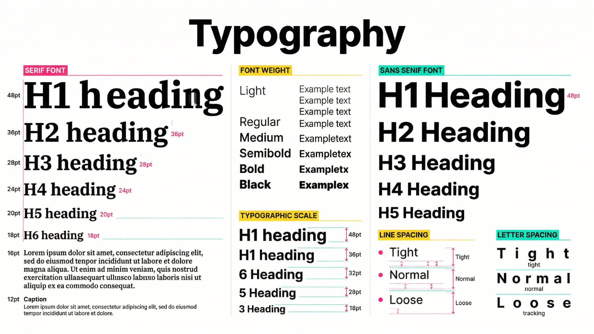
A strong typographic system usually consists of:
- Headline font: A bold, distinct typeface designed to grab attention.
- Body copy font: A highly legible, simple font prioritized for long-form reading.
- Accent font: An optional, stylized font used sparingly for call-outs or specific branding moments.
4. Imagery and photography
Even if your logo and colors are perfect, generic stock photos can instantly dilute your visual identity. Your imagery style dictates how you capture the world visually, setting a specific tone and atmosphere.
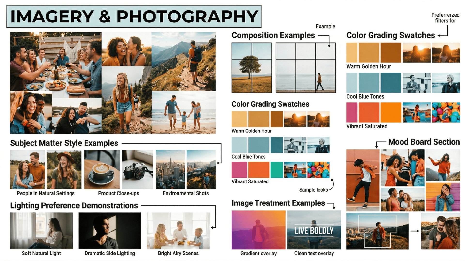
It is crucial to establish strict guidelines for all visual media to maintain consistency. This includes defining rules for:
- Lighting and composition: Are your photos bright and airy, or dark and moody?
- Subject matter: Do you feature candid, lifestyle shots of people, or clean, minimalist product close-ups?
- Treatments and filters: Applying consistent color grading, overlays, or borders to unify varied images.
5. Graphics and illustrations
Beyond photos, the custom graphics and illustrations you use add a unique layer of personality that photography simply cannot capture. Illustrations are excellent for explaining complex concepts or adding a playful touch to a serious subject.
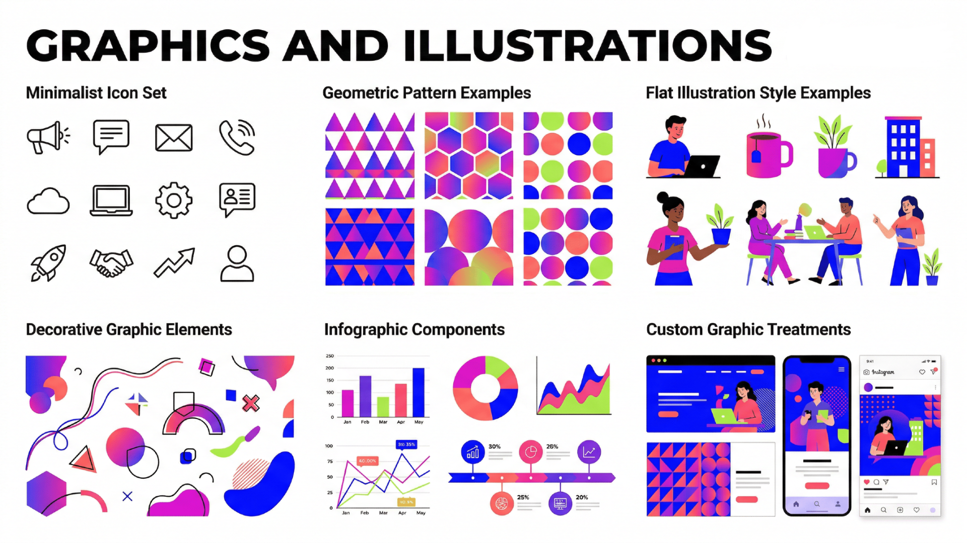
To ensure these elements strengthen rather than confuse your visual identity, they must adhere to a unified style:
- Line weight and style: Are the lines thick and bold, or thin and delicate?
- Dimension: Do you use flat 2D vector graphics, or rich 3D isometric designs?
- Color integration: Ensuring all custom illustrations strictly utilize the established brand color palette.
6. Layout and composition
Sometimes referred to as the invisible grid, layout and composition dictate how all the other visual elements are arranged on a page or screen. It is the structural framework of your visual identity. Without rules for composition, designs can quickly become cluttered and chaotic.
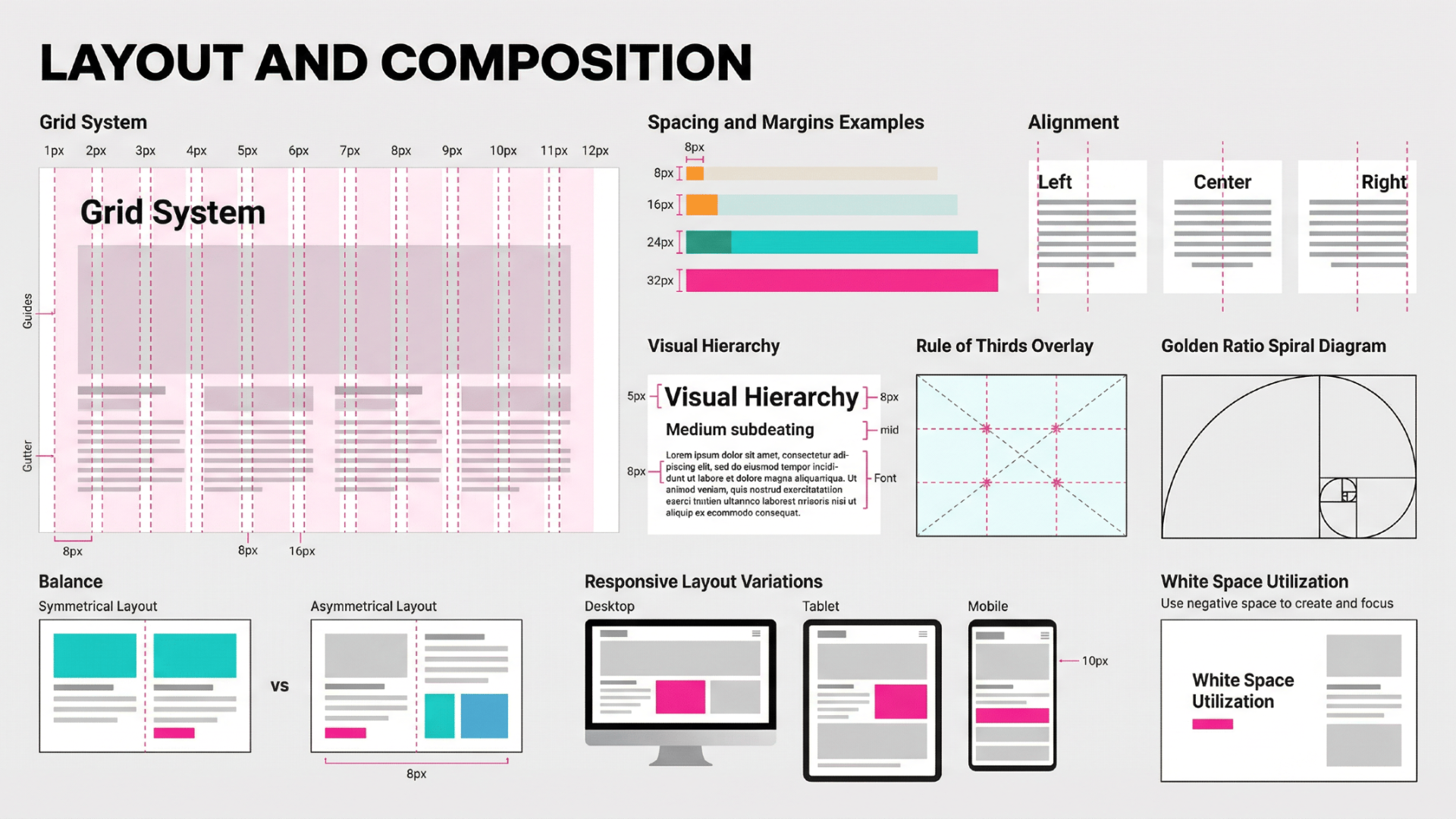
Strong layout guidelines dictate the spatial relationships between elements, focusing on:
- Whitespace (negative space): Rules on how much empty space must surround text and logos to ensure readability and elegance.
- Hierarchy: How to visually guide the viewer's eye from the most important information to the least.
- Grid Systems: Standardized column structures used for consistent alignment.
How to create a visual identity: a 5-step process
Creating a visual identity is a strategic journey that requires deep thought and meticulous execution. Follow this structured five-step process to build a cohesive, impactful visual presence for your brand.
Step 1: Understand your core brand identity
Before designing anything, you must clearly define exactly who you are. Outline your core mission, values, target audience, and brand personality. Are you playful or serious? Budget-friendly or luxurious? This foundational understanding acts as your ultimate compass, ensuring every subsequent visual choice authentically reflects your company's true essence perfectly.
Step 2: Research and analyze your competitors
Examine the visual landscapes of your direct competitors. Note their color palettes, typography, and imagery styles. The goal is not to copy them, but to identify industry norms and find crucial gaps. By understanding what others are doing, you can strategically position your visual identity to stand out distinctly.
Step 3: Develop your foundational assets
Now, translate your strategy into tangible designs. Start with the most critical element: the logo. Once the logo is finalized, build the supporting visual pillars. Select a color palette that evokes the right emotions and choose typography that communicates your brand’s voice. These core assets form your essential toolkit.
Step 4: Leverage generative AI tools
Accelerate asset creation using advanced AI tools like Framia Pro. Its "Design" agents transform outputs into editable layers, while "Video" agents offer automatic storyboarding and character consistency for dynamic media. Using chat-to-edit features ensures strict brand integration across multiformat exports, saving 80-90% of your traditional creative production time.
Step 5: Create comprehensive brand guidelines
Finally, document every decision in a brand style guide. This vital rulebook dictates exactly how your logo, colors, fonts, and imagery should be used across platforms. By setting strict parameters for sizing, spacing, and layout, you guarantee that anyone creating content will maintain perfect visual consistency and brand integrity.
Creating your brand visual identity with Framia Pro
Framia Pro is a revolutionary AI-powered platform designed to seamlessly build and manage your brand's visual identity. By combining advanced design and video agents, it allows creators to generate, edit, and export stunning branded content across multiple formats, ensuring absolute consistency while saving you countless hours of production time.
Why use Framia Pro for your brand's visual identity?
- Seamless brand integration: Automatically apply your specific logo, typography, and custom color palettes across all generated designs for perfect consistency.
- Editable split layers: Transform AI-generated designs into fully separated layers, giving you professional-grade flexibility to move, resize, or delete elements.
- Intuitive chat-to-edit: Simply type commands like "make the logo bigger" to refine specific details without regenerating the entire design asset.
- Flawless character consistency: Maintain the exact same characters and visual styles across multiple video shots, perfect for cohesive brand storytelling.
How to use Framia Pro to create your brand's visual identity?
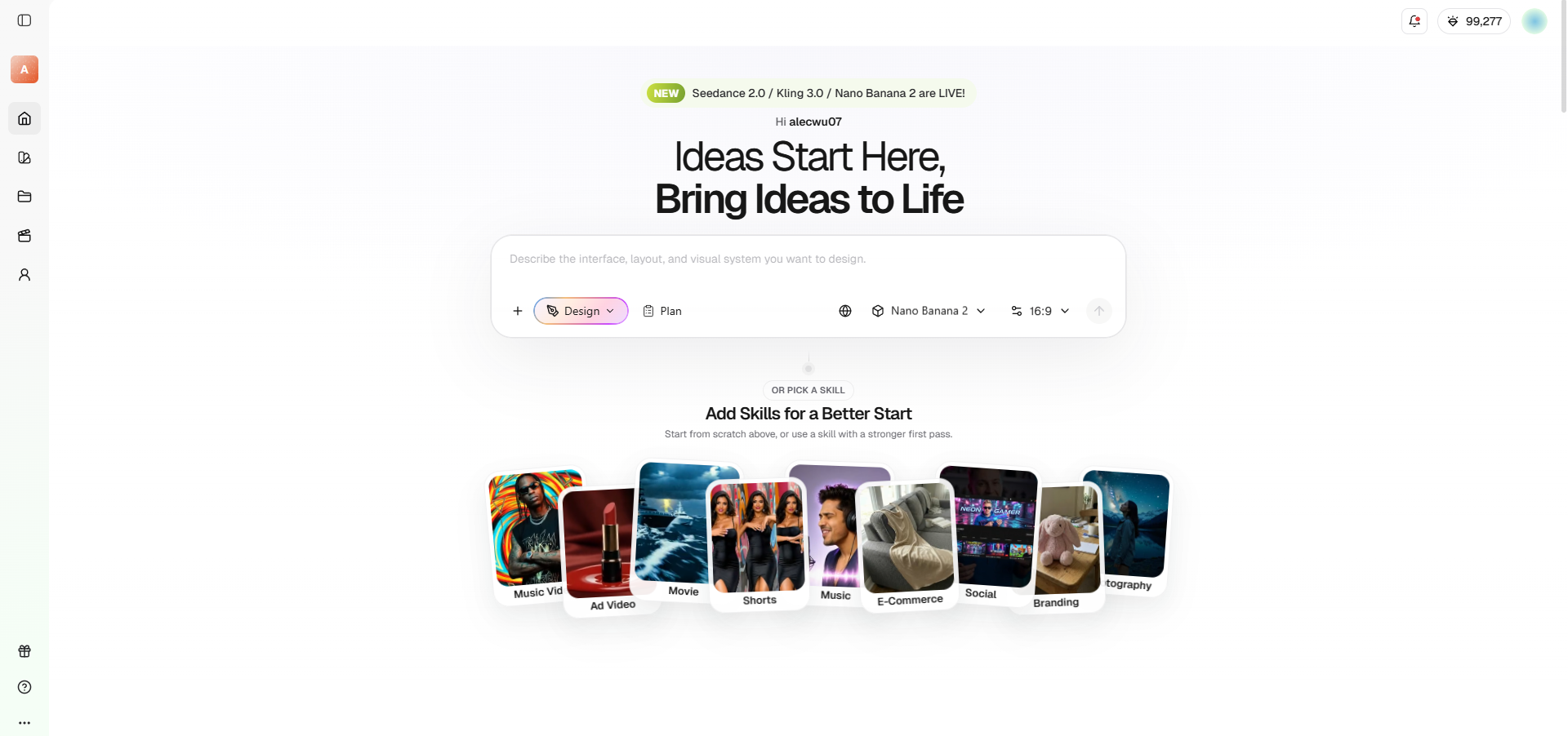
Step 1: Select Framia's "Design" agent and choose your AI image generation model
Begin your creative process by accessing Framia Pro and selecting the dedicated "Design" Agent. Next, choose your preferred AI image generation model from powerful options like Seedream, Nano Banana, Flux Max, or Midjourney to match your desired aesthetic perfectly.
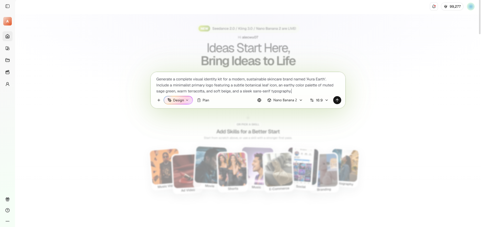
Step 2: Provide a detailed prompt to create the perfect visual identity graphic design
Input a highly detailed text prompt describing your brand's unique vision, color palette, and preferred typography. The advanced AI will instantly generate stunning, multi-layered visual assets tailored to your exact specifications, giving you a solid foundation for your brand identity.
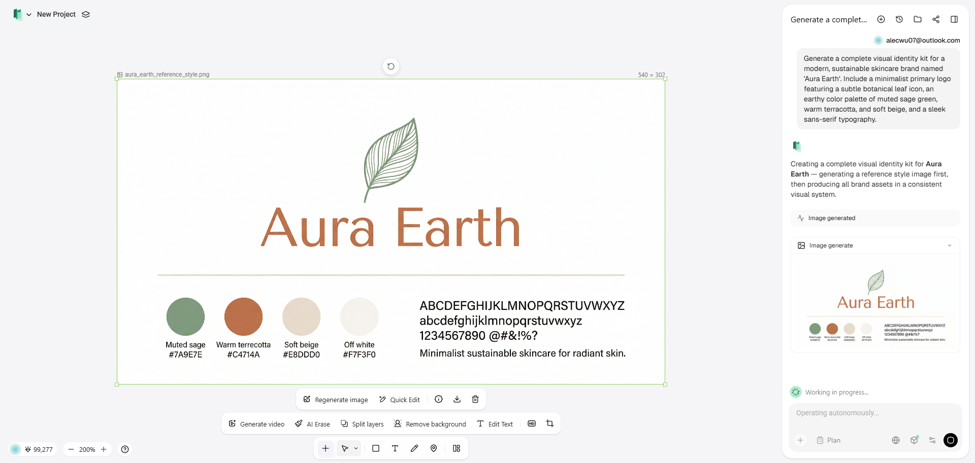
Step 3: Finalize and use your visual identity design in all your brand's promotions
Refine your generated assets using the intuitive chat-to-edit feature and pixel-level brush tool. Finally, seamlessly export your fully optimized, brand-integrated designs across multiple formats, ready for immediate use on your website, social media, and all other promotional marketing channels.
Channels through which you can make your visual identity work
Your visual identity must be consistently applied across multiple touchpoints to be truly effective. Here are the primary channels where your visual branding comes to life and interacts with customers.
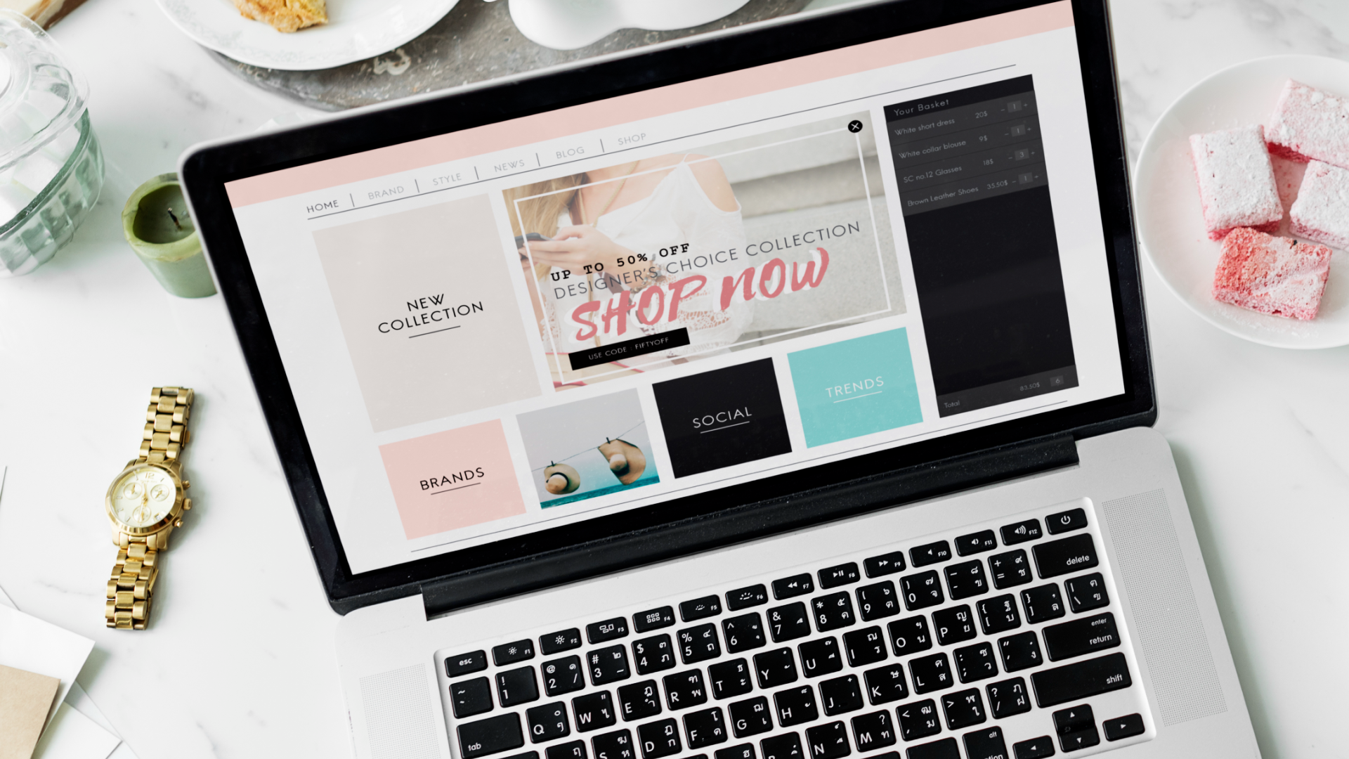
- Website and digital interfaces: Your website is your digital storefront. From the layout and button colors to the typography and custom icons, every digital interface must strictly adhere to your visual identity to provide a seamless, professional, and easily navigable user experience.
- Packaging and physical products: For physical goods, packaging is often the first tactile interaction a customer has with your brand. Consistent use of logos, brand colors, and unique graphic elements on boxes and labels turns ordinary packaging into a memorable, premium brand experience.

- Social media platforms: Social media requires constant visual output. Whether it’s Instagram posts, YouTube thumbnails, or LinkedIn banners, applying your specific colors, fonts, and imagery styles ensures your content is instantly recognizable in crowded feeds, boosting both engagement and long-term brand recall.

- Marketing and advertising campaigns: Whether running digital ads or printing physical billboards, your promotional materials must visually align with your brand. Consistent visual cues across all campaigns compound your brand awareness, ensuring that every marketing dollar spent reinforces your core visual identity.

- Internal communications and culture: Visual identity isn't just external. Applying your brand’s aesthetics to internal newsletters, employee handbooks, office decor, and presentation decks fosters a strong sense of company culture and ensures your team is deeply aligned with the brand's overarching visual language.

HTop brand visual identity examples that can inspire your creativity
To truly understand the impact of visual identity, let's look at some of the world's most successful companies. These iconic brands have mastered visual consistency to create unforgettable, instantly recognizable global presences.
Nike visual identity
Nike relies on the iconic "Swoosh" and bold typography. Their high-energy, athletic imagery and stark black-and-white contrast instantly convey a sense of motion, empowerment, and relentless determination across all media.
Netflix visual identity
Netflix uses a striking red-on-black color palette to evoke the feeling of a dark movie theater. Their clean, bold typography and dynamic interface prioritize content, creating an immersive entertainment experience.

Airbnb visual identity
Airbnb centers its identity around the "Bélo" symbol, representing belonging. Their soft, warm color palette and authentic, user-generated-style lifestyle photography evoke feelings of community, travel, and welcoming global hospitality.
Apple visual identity
Apple is the gold standard for minimalist visual identity. Using generous whitespace, sleek monochromatic tones, and crisp product photography, they consistently communicate premium innovation, simplicity, and high-end technological elegance.
Amazon visual identity
Amazon utilizes its familiar black and orange color palette with the iconic "smile" arrow logo. This simple yet highly recognizable design emphasizes speed, customer satisfaction, and an infinite product selection.

Crucial visual identity trends to watch in 2026
The design landscape is constantly evolving, driven by technology and shifting consumer preferences. To keep your brand feeling fresh and relevant, here are the top visual identity trends dominating 2026.
- Hyper-personalized AI graphics: Brands are utilizing AI to create dynamic, real-time visual assets tailored precisely to individual user preferences and behaviors.
- Immersive 3D elements: Flat design is fading, replaced by rich, interactive 3D graphics that add profound depth and tactile realism to digital interfaces.
- Sustainable and eco-aesthetics: Consumers favor earthy palettes, organic textures, and minimalist packaging that visually communicate a strong commitment to environmental sustainability.
- Motion-first branding: Static logos are being replaced by dynamic, animated identities designed specifically for video-first platforms like TikTok and YouTube Shorts.
- Nostalgic Y2K revival: Early 2000s aesthetics, featuring bold metallic gradients, pixelated typography, and vibrant cyber colors, are making a massive comeback among younger demographics.
Tips & tricks to make your visual identity count
Before you officially launch or revamp your visual identity, there are a few crucial details to verify. Keep these final tips in mind to ensure a flawless and impactful rollout.
- Prioritize mobile responsiveness: Ensure your logo and typography remain perfectly legible on small screens. Your visual identity must scale down elegantly, as most digital interactions now occur on mobile devices.
- Test across backgrounds: Never assume your logo works everywhere. Rigorously test your assets on light, dark, and photographic backgrounds to guarantee visibility and contrast in any potential marketing scenario.
- Check for accessibility: Ensure your color palette meets minimum contrast ratios for visually impaired users. An inclusive visual identity is not just ethical; it is absolutely essential for reaching broader audiences.
- Keep files organized: Maintain a centralized, easily accessible folder containing all high-resolution logos, font files, and brand guidelines. Disorganization quickly leads to team members using outdated or incorrect visual assets.
- Stay flexible yet consistent: While consistency is paramount, leave room for your identity to evolve. A rigid brand breaks, but a flexible visual system adapts smoothly to new platforms and ongoing marketing campaigns.
Wrapping up
Your visual identity is much more than a collection of pretty colors and a catchy logo; it is the silent ambassador of your brand. From core elements like typography and imagery to their strategic application across websites and social media channels, every visual decision shapes how the world perceives your business.
By understanding the critical distinction between brand and visual identity, systematically crafting your assets using powerful tools like Framia Pro, and staying attuned to 2026's design trends, you can create a compelling aesthetic that commands attention.
Remember that visual consistency builds consumer trust, and trust inevitably drives long-term loyalty. Invest the necessary time and resources into building a strong, cohesive visual identity today, and it will serve as an unshakeable foundational pillar for your brand’s growth, recognition, and success for years to come.
FAQs
How much does it cost to create a visual identity?
Costs vary widely. A DIY approach using AI tools like Framia Pro is highly affordable, while hiring top-tier design agencies can cost thousands depending on your specific business requirements.
How often should I update my visual identity?
You should review your visual identity every few years. Minor tweaks keep it fresh, but full rebrands are only necessary if your core business or target audience significantly changes.
Can I create a visual identity without a designer?
Yes, absolutely. Modern generative AI tools and user-friendly design platforms allow founders to build professional, cohesive visual identities themselves, saving substantial time and money during the early startup phases.
What is the most important element of visual identity?
While all elements matter, consistency is the most crucial aspect. A simple, perfectly consistent visual system across all channels will always outperform a beautifully designed but inconsistently applied identity.
Does a small business really need a visual identity?
Yes. A strong visual identity instantly builds credibility and trust, helping small businesses look professional and established. It allows you to compete effectively with larger companies in your industry.